NameGroupGraphs: Interactive Popularity Graphs for Groups of Names
The graphs here show you the popularity of names over time, using lists of the most popular names for newborns in a large number of countries, provinces and cities, called series. The complete list of series is here.
There are 4 different kinds of graphs, selected by using the corresponding "tabs":
Name + Variants: Graph the popularity of a given name in a single series, and add curves for all the variants of the name that also rank in this series. Examples: Sophia in the USA James in England plus Wales
Simply Name: Graph the popularity of a single given name in a single series. Best for small displays. Examples: Emma in the USA James in England plus Wales
Name in All Series: Graph the popularity of a given name in all series where it ranks or ranked at least once. This allows you to compare the popularity of a name in different countries. Examples: Sophia in all Series Noah in all Series
Top Names: Graph the popularity of the top 10 names of a series as they were at the top in the selected year of the series. See when and how fast Emma, Olivia, Sophia and the next 7 most popular names of 2014 in the US became so popular: Top Names in the USA
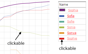
The lines in the graphs are interactive: If you hoover the mouse pointer over a line you see the corresponding name in a popup. If you select a line it is drawn thicker, and the display of the ranks at the right side of the graph switches to the corresponding name. You can also click on the colored rectangles in the list of names or series at the right of the graph to switch: